
It doesn’t matter if you have a beautifully designed button in the wrong place—it will frustrate the user and curse your decision of placing the button there. It is important to think how the user will experience that button, interface, website, product, and in what context.
Minimise
Once you have identified a problem and what you want your product to do, you have to start thinking about the user experience. The user won’t just be staring at the beautiful product, they’ll also interact with it.
So think specifically about every product’s element and interaction with it. Is that element necessary? If it’s not, then remove it. Question everything, even the most trivial stuff. How the user will move (user flow) from one page to the next. What content will go on each page (copywriting). In more general terms: how your app, website, or product will work. You have to sweat the small stuff.
Delight the user
The end goal is to solve the problem that the user has but also provide a delightful, memorable experience from this process. Ask yourself how useful is your proposed design? How usable is your proposed design? Does it delight the user and makes the product memorable? Does it take too much time to load the interface? Refactor your code to make your app faster, more responsive. Users will be thankful.
Think about how your product works. Does it work well? Why? That’s just your opinion. Ask someone else.
Test everything
Don’t punish the user for any mistakes they might make. It’s your job to help me avoid making mistakes. Errors are part of the product and you should’ve spotted them during testing. Do you recall the cell reception problem iPhones had when you were holding the phone in a certain way? They said we were holding it wrong. No, Apple designed it wrong.
See, whenever you have the user interacting with a product, they are free to abuse it in any way they see fit. It’s your job to take into account all the different ways your product can be used. So you have to test everything. Once you are done with testing, analyse the results and make improvements.
Design empty states
![]()
For apps and websites an important part often forgotten are the states of the app/website. These states are still part of the user experience, so don’t forget them. Design the initial state (first-time user) of the app, logged in state, the empty state, and any error states—though you should avoid showing errors altogether.
Guide the user
People like to be guided, i.e. told what to do. A compelling experience guides the user through the product. For example, one of the most recent memorable walkthroughs that I experienced was in Vine application:
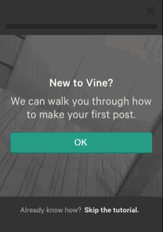
Vine shows you an interactive tutorial how to record your first Vine, and once you are done with the walkthrough, the video you recorded is ready to be published. They guide the user through these different stages (recording, posting, browsing), seamlessly. Brilliant.
Don’t annoy the user
Go easy with guiding the user, however. There’s a thin line between informing the user and showing a too detailed walkthrough of the product. If you cross it, you will annoy the user, and ruin their experience. Most users, when they see a new interface, they want to play with it. They want to click stuff, open windows, try to break the software, etc. Give them this flexibility by allowing them to skip your tutorial and come back to it later.
Provide visual cues
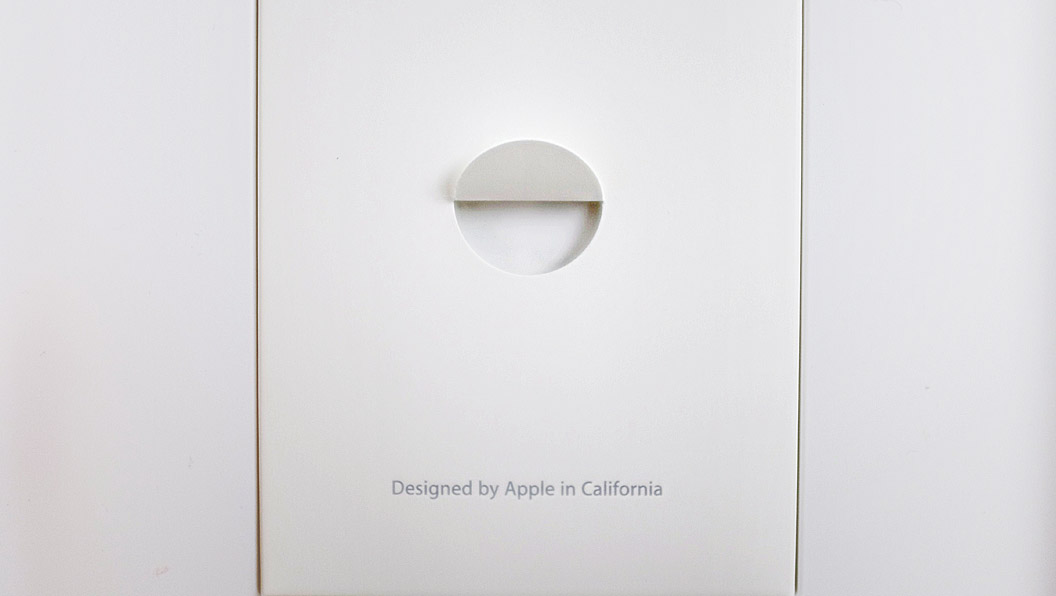
Think how Apple packages their products. They don’t have instructions showing you how to lift the instructions booklet, but you know how to do it because of the visual cues.
The same goes for interfaces. Provide the user with visuals which clearly indicate that a button is clickable or there is a drop-down menu for that option. The small stuff add up and make an experience good or bad.
Tell a story
I don’t mean you should come up with a story similar to Red Riding Hood. Have your ideals, vision, concept, reflect in your products and the process of making them. If you are into saving Earth, and minimising waste, you would choose a biodegradable element over plastic for the material of your product. Similarly, if you’re concerned about accessibility, you would have strong contrast between text and background—because it’s easier to read, and never use Helvetica Neue Light for interface text—because it’s difficult to read.
Express the things you value as an individual and incorporate them in your brand, product, website, app. This will distinguish you from the competition and create a unique user experience by fascinating the user with a small insight into your world.
“Design is not just what it looks like and feels like. Design is how it works” — Steve Jobs