Pixel perfection. Every designer worth its salt strives to make its designs pixel perfect. Unless they’re designing for the web. The web is diverse, fluid, overwhelming, even chaotic. You can browse the web from a tablet, a mobile, on Apple iOS 4 or Android Ice Cream Sandwich, a retina device, an old monitor, using Google Chrome, or Internet Explorer, and so on.
TL;DR: Pixel perfection on the web is nearly impossible.
Yet I challenged myself to try and do it, by redesigning this website.
##Pick a grid I chose to work on a 32px grid. If you’re using Photoshop, go to Preferences [Cmd + K] > Guides, Grids & Slices, and add a Gridline every 32 pixels with Subdivision of 1. To view the grid, go to View > Show > Grid [Cmd + ‘].
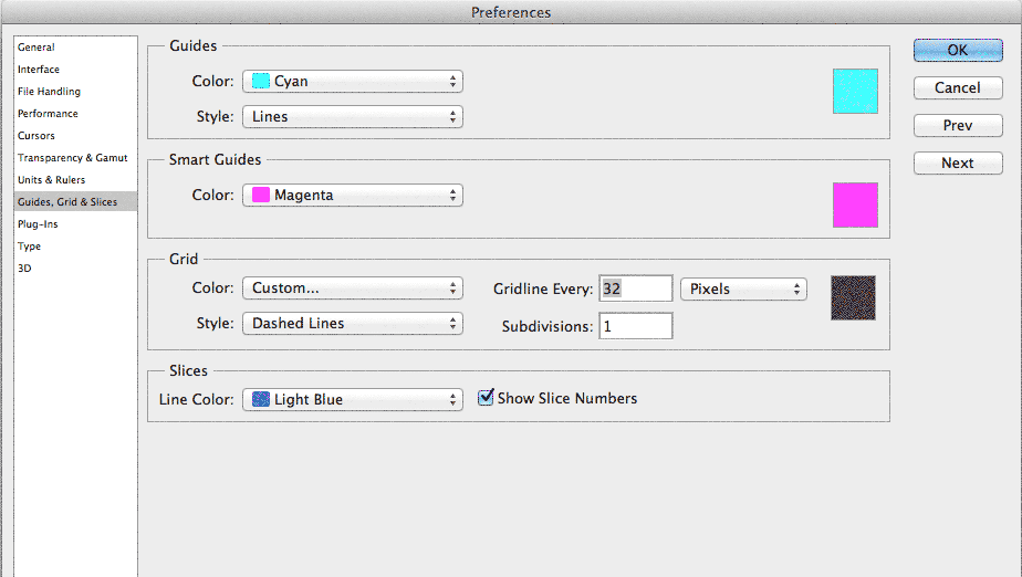
Stick to the grid. Every vector icon, image, text, container, needs to adhere to the 32 pixels. To help you out, Photoshop can snap your elements to the grid. To enable it go to View > Snap To, make sure Grid is checked, and enable by going to View > Snap [Shift + Cmd + ;].
When it’s time to code your pixel-perfect website, you can create a 32px x 32px transparent PNG pattern that you can use as a background, to help you out. Create two 1px lines and place them on top and left side of the pattern (example).
##A grid of 32px until it isn’t If you clicked to study this website on the grid, and your browser screen is wider than 1280px, you might have observed that the text doesn’t fit vertically the 32px lines. That’s because the font size of the text is bigger, meaning that the line height is bigger than 32px. Resize your browser a bit to see text fall into place. The same applies to mobile devices (font size is smaller).
##Compose to a vertical rhythm The web consists mostly of text and cat pictures. Leaving cat pictures aside, text needs to be readable. Vertical rhythm refers to the spacing and arrangement of text as the reader descends the page. It is contributed to by three factors: font size, line height and margin or padding.

To improve readability, keep your text length between 50 and 75 characters per line. For body text, the line height should be 1.6x the font size. So for a 20px font size, the line height would be 32px (our grid). Read more on how to compose to a vertical rhythm.
When you measure vertical height with text, always exclude ascenders and descenders, because each type is different. Measure everything from the X-height, which is the height of the body, minus ascenders and descenders. This is equal to the height of the lowercase ‘x’, hence its name.

##Retina revolution I don’t own a retina device. I almost bought one in September 2012, when on the lookout for a new laptop (went for a 13” Air). Retina is the future, and in order to future-proof your pixel-perfect website you need to use SVG (Scalable Vector Graphics) when exporting your graphics. By using SVG, you can scale the image infinitely without losing quality and pixelating/blurring the graphic. I wrote in a previous post how to make your website pretty for retina devices.
There is a rule when exporting assets. You use JPG for photographs, and PNG for graphics. By doing that you reduce the file size of the asset. That is because graphics usually consist of large blocks of colour that are displayed more efficiently with PNGs. I say scratch that; use SVG instead of PNG. SVG can reduce the file size even more than PNG.
To demonstrate, see the image before the image above? When exporting a:
- JPG at quality at 60, file size is: 126KB.
- PNG-8 with 16 colours, file size is: 30.43KB.
- SVG with embedded glyphs, file size is: 29KB.
- SVG with system fonts, file size is: 14KB.
In contrast, the image above is 12KB in PNG-8 and 20KB in SVG (embedded glyphs). But for 8KB more, I get to scale the image infinitely.
Did you know: Most images of this blog (and of this post) are SVGs.
##Pixel-perfect icons Creating pixel-perfect icons is not an automated process. In your Photoshop preferences, if you have Snap Vector tools to pixel grid enabled, you might need to disable it in some cases. By disabling this feature, you can move Vector shapes in increments smaller than 1px, the so-called “pixel hinting”. More on pixel hinting.
For production, you can export the icons as SVG and format them into a typeface (for easier scaling and embedding). There’s a cool app that helps you with that, called IcoMoon. That’s the app I used for all the icons you see on this site.
##Developing the pixel perfect website All is well inside Photoshop (or Sketch), but once you switch to the browser, all Hell breaks loose. Some prefer to design purely in the browser. I prefer to use a hybrid method.
It’s easier/faster for me to move elements inside Photoshop. Once I have a rough pixel-perfect layout, I switch to the browser and start coding it. In the browser, it’s not uncommon to change things around, especially if I’m doing responsive layouts. Oh, and I hate bootstraps and ready-made grids. I’m paranoid about my code and I want to know what every bit of code does what. I can make changes faster this way. Also, using a bootstrap doesn’t allow you to learn how to properly code CSS.
In order to develop a pixel perfect website, you need to know your CSS. I mean really know it. Perfect your CSS coding skills with Treehouse. Accept the fact that your code might get ugly for the sake of pixel perfection. Because you need that super fine control, it’s not uncommon to find code like:
.title {
  margin: 1px 0 0.55em;
}
And that’s ugly. But it works.
Another important tip is: do not round decimal places. Let the browser do the calculations. If we have a line height of 48px / 36px don’t do this:
h2 {
  line-height: 1.333; // [48 / 36 = 1.33333333]
}
Failure in doing so, will result in a not so pixel-perfect website.
##Test on actual devices Forget simulators. Ask your friend if you can borrow his Samsung Galaxy S4 to test your website. Go to your local Apple store and try out your website. Dust your old devices from the attic and test your website. Build a device lab. The more devices you test, the more pixel-perfect your website will be.
##Pick your battles Accept that you website won’t be pixel-perfect. I made this website pixel-perfect for Google Chrome, iPad, and iPhone, but I decided to not support IE 8. Unless you have an unlimited budget, you cannot make your website pixel-perfect in all browsers. Like I said in the beginning: the web is too diverse. Pick your battles and move on.