Designing for the past
The more time you spend designing/coding websites to look good on old browsers, the less time you spend coming up with ways of improving and innovating existing concepts. You’re not pushing the boundaries, you’re not building on top of technology, you’re not creating unique, original, experiences.
I used to care a lot about accessibility and spend hours making my website look good on old versions of Internet Explorer because that would make my site accessible, therefore experienced by as many users as possible. By spending time on old browser compatibility issues it made me a good designer, a caring designer. That’s what I thought. After all, to what good is a website with super heavy, cutting edge, CSS 3 animations if no one’s gonna browse it, right?
So I didn’t spend time designing/coding my site for the future, but rather I spent much time fixing it for the past. Wanna know how it looked in the end? Dated. Archaic. Old. It featured a mediocre design, and because I had created it, I was its mediocre designer. It pushed no boundaries, it didn’t innovate, it didn’t push the web forward, it stirred no emotion amongst users. Nowadays, I define these websites/apps/services/devices as “meh”.
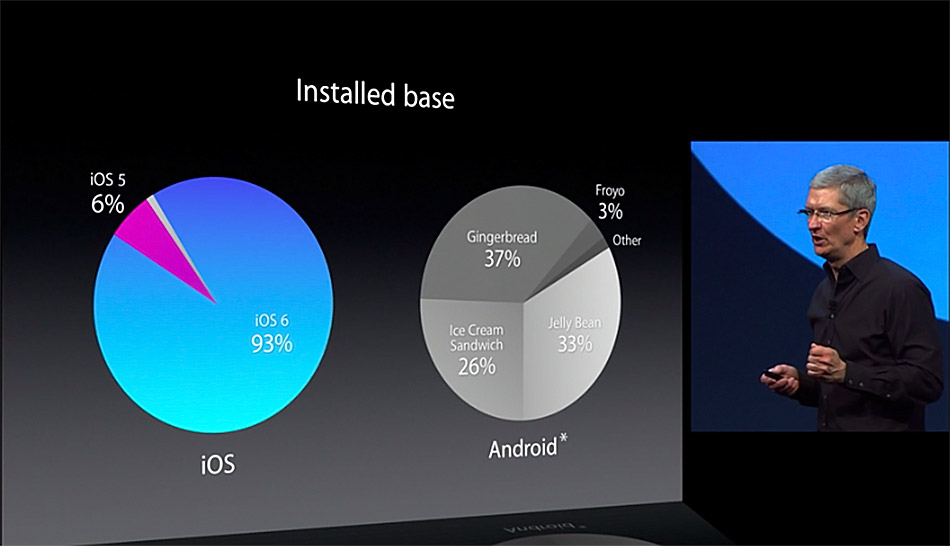
People ask me why I don’t own an Android device. I’m technically a geek, so all the customisations and options available on Android should make me happy. Yet two of the reasons I hate Android is their UI inconsistency and inability to innovate on the user experience. Even though Android phones pack a 1.6 GHz quadcore processor, the apps—you know, the things I use to interact with the phone—still look ugly and the animations feel dated; they look old. That’s partially due to Android’s fragmented ecosystem and the slow new OS adoption rate. Apple boasts with the fact that most of its users are using the latest version of iOS. And that’s good, because it allows iOS developers and designers to use the latest technology and design for the future, by knowing they won’t have to support older versions of iOS for long.

At my school we used IE 6 to browse and build websites, Firefox was a commodity, but updating Internet Explorer on all the lab computers would have been very consuming. I get that not everyone has the possibility, or preference, to switch to a better browser, purchase the newest laptop, use the latest OS, keep up with the fast pace of change. In the end, to each their own. But refusing, or being unable, to upgrade revokes your right to expect from me to keep designing for your old OS.
An experiment
Let’s try a hypothetical experiment: for one month, somehow, every website will render unusable for Internet Explorer 9 users and below.
Certainly, most users will be pissed, sales will drop, angry emails will follow, but eventually do you know what would happen at the end of that month? Everyone would have switched from < IE 9 to a better browser. Because our tools, in our case browser, are only as good as what you create with them, in our case view websites.
Designing for the future
I prefer to spend my limited time on this planet designing for the future, on the cutting edge, pushing the limits, and improving my industry.
Am I a lazy designer for not trying to fit old versions in and for not using CSS hacks to make websites accessible to older browsers? No. I could argue that you’re the lazy one. Because you don’t try to come up with new, undiscovered ways of innovating in your industry. You’re not utilising existing technology to its full potential. You’re making one step forward, two steps back.
I chose to design for the future, today. Because that’s the place where change happens. That’s where progress is made. That’s where our future is created. Today’s new, cutting edge, becomes tomorrow’s standard. So if you wish, feel free to categorise me as a future—sensitive designer.
A proposition
Rather than spending time designing for the past, where many users are, and trying to fit the past in the present I’d try something else. I’d try to come up with ways future users won’t get stuck in the past. Things like making it easy for users to upgrade and update—maybe do it automatically, and simplifying the transition phase. Humans tend to hate change. I would still be stuck with Google Chrome 20 if it wasn’t for their auto-updating mechanism.
Be grateful
My mom came up to me the other day with something along the lines of “being grateful is the best thing you can do in this world”, quote she read in some book. I responded with:
Being grateful is the biggest enemy of progress.
If I were grateful because I’m breathing today I would do nothing all day; breathing is enough. I wouldn’t try to improve, I wouldn’t be curious, I wouldn’t try learn stuff or practice to become better. Our civilisation wouldn’t have reached the current level. We wouldn’t have invented the wheel, walking is adequate; it’s way too difficult to come up with ways to travel faster than walking, using a wooden circle. The Pyramids wouldn’t have been built; erecting buildings in triangular shape isn’t standardised, let’s stick with squares. We wouldn’t have electricity, computers, a mouse, the Internet, Photoshop, Google Chrome, touch screens, 12hr laptop battery life, 1080p mobile screens, NFC, wireless charging, and so on.
So you can either join me and help move the web forward, design for the future, be an inventor, an early adopter, a future-sensitive designer, or go back to fixing IE bugs, and spending more time in IE than you’d like to admit.